Accenture Song: Optimizing the car configurator journey

About the project
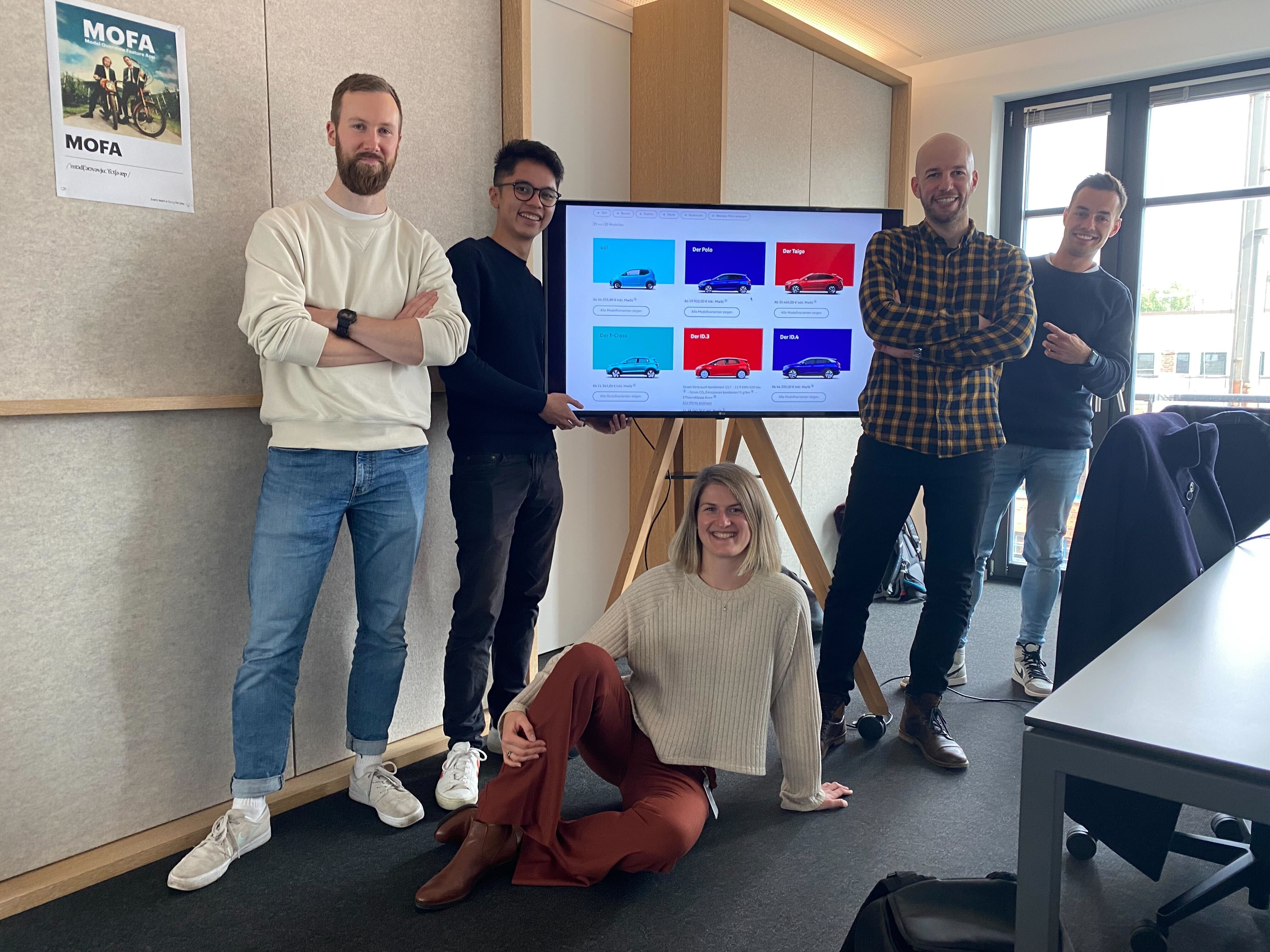
Our team: 5 Product designers from 2 scrum teams
Tools: Figma, Protopie, Mural
Duration: 2 months
My role is a UI/UX designer out of 2 designers at Model overview team.
Model overview consists of current car models that Volkswagen offers on each market. Cars were presented only through side view angle, together with a backplate, which is a car colour paint of each model.
Depending on the model and markets, some cars must include WLTP standards (mandatory by EU), which we later on, left on backplates and ensured they have enough WCAG Contrast ratio. We thought of this approach at the beginning, but then on, we’ve got help from VW legal team which ensured it’s compliant with the EU law.
Workshop called Mission 3 was undertaken to test our hypothesis and analysis to improve these two steps, out of three user journeys we have (Home page, Showroom journey, Configure journey). Parts of Model Overview team were only two first configure steps, Model and Trim selection, which we tried to improve at this workshop.
Analysis
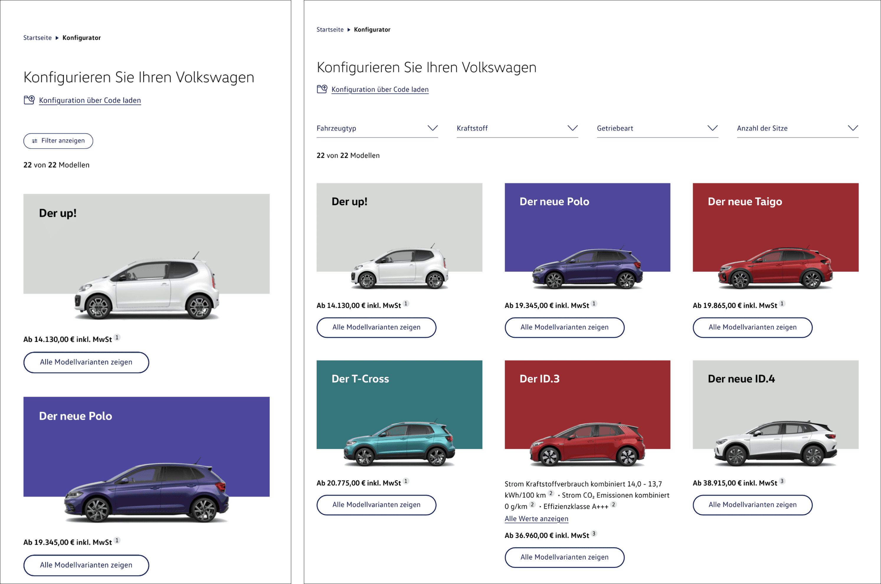
Status quo design
At first, we have checked and seen a dropping click rate through Adobe Analytics, which was especially poor on mobile viewport. Our initial solution was to target a better mobile responsiveness design for filtering solution. Another idea was to improve click-through rate at first step which meant to rethink CTAs usage, since secondary CTA was all over the place.
But the biggest problem we were facing was a high drop off rate at trim level step, since each car buyer is not even familiar with terms like “trim”, which we saw at previous user testings.
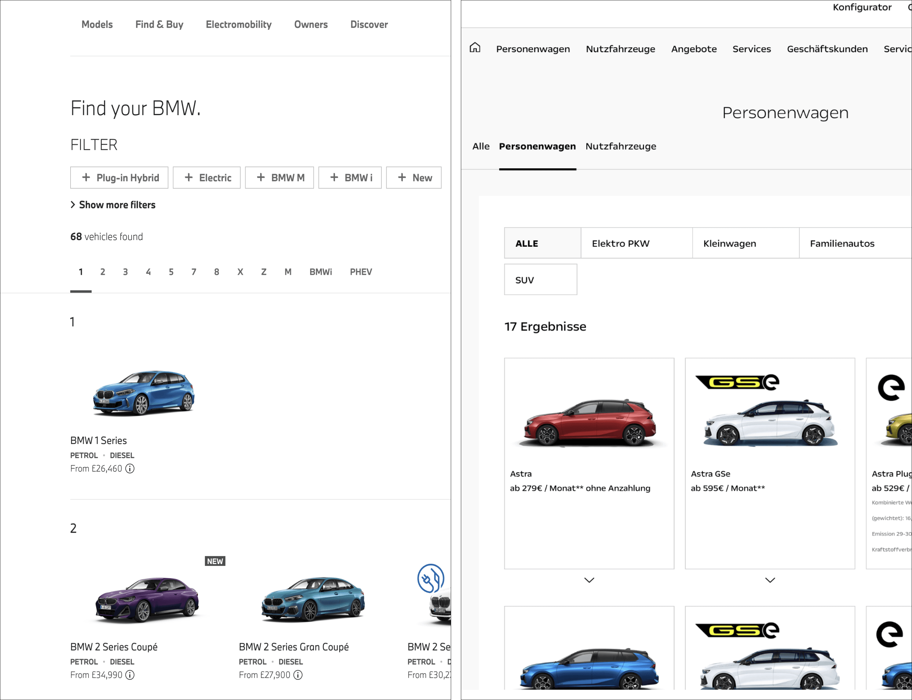
BMW and Opel as competitors
After all that, we have checked all the e-commerce pages, especially all the other competitors brands like BMW or Opel and get inspired to take the best features that were missing on our page.
Prototype creation
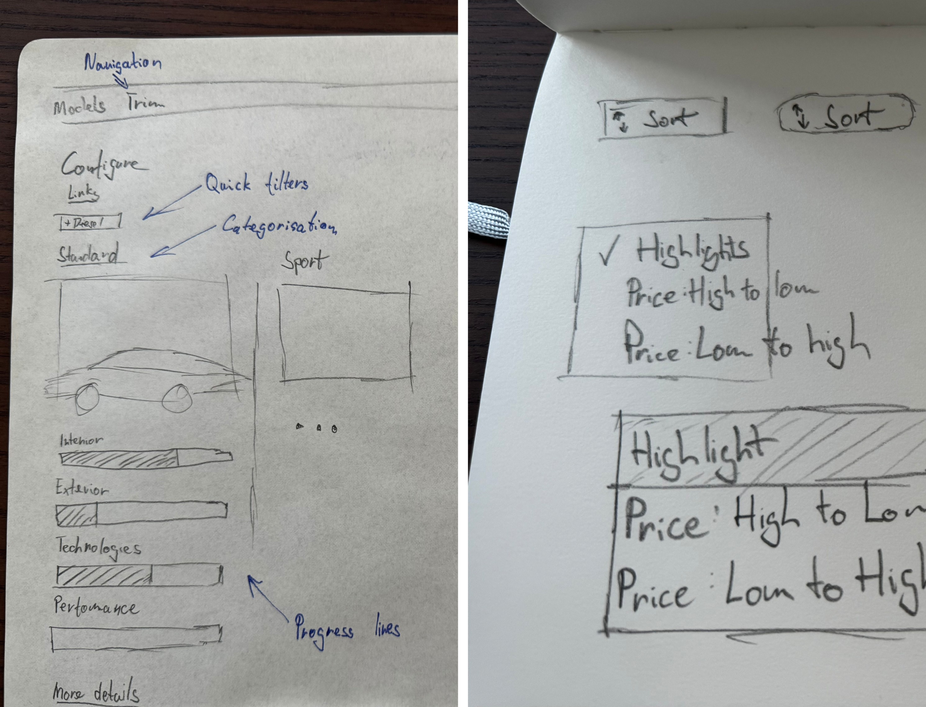
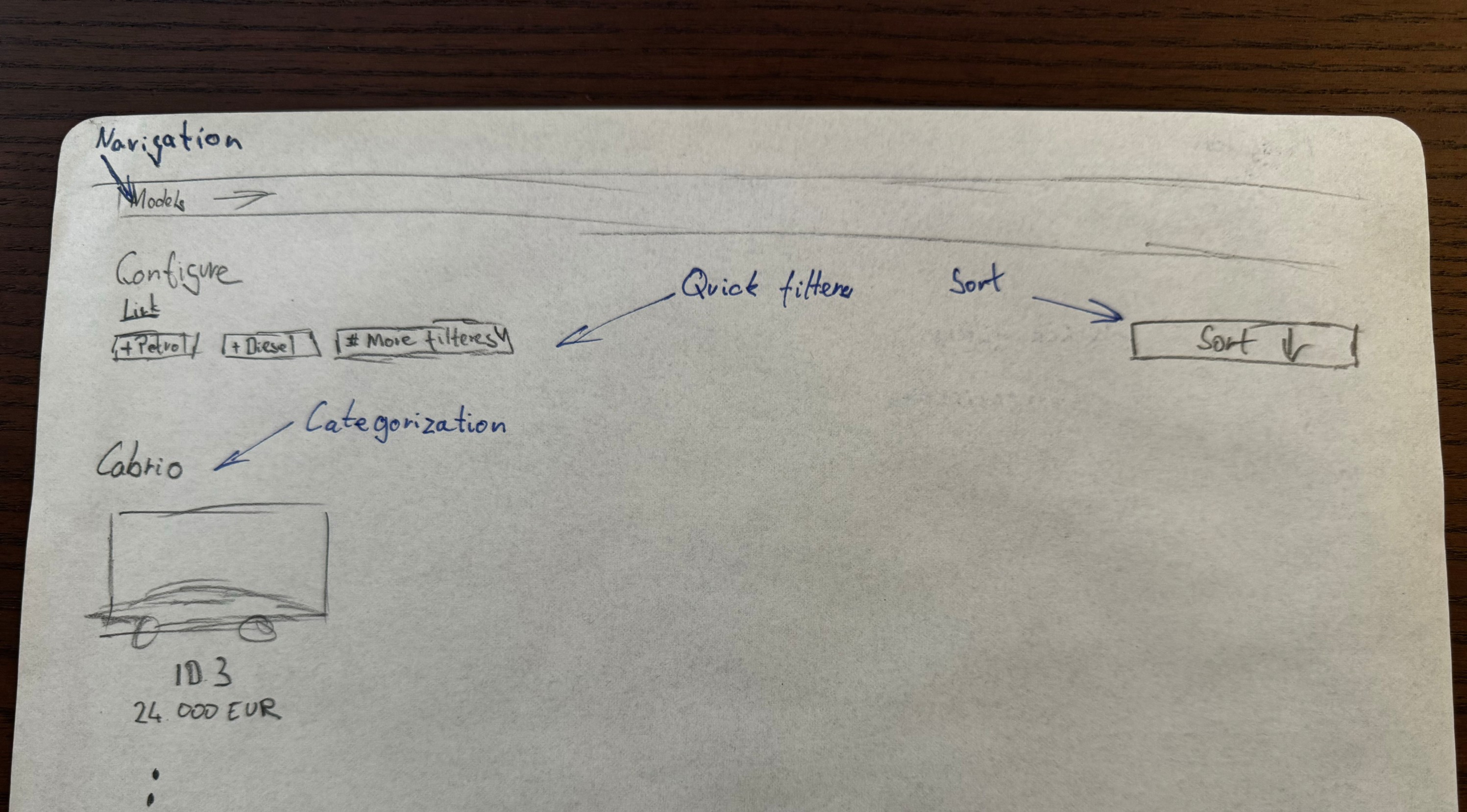
Idea sketches from meetings/workshop
During the workshop with Configure design team, we came up with two versions to be qualitative tested since we needed a rich feedback of our potential major changes to our full configure journey (e.g. navigation, progress bars, summary step).
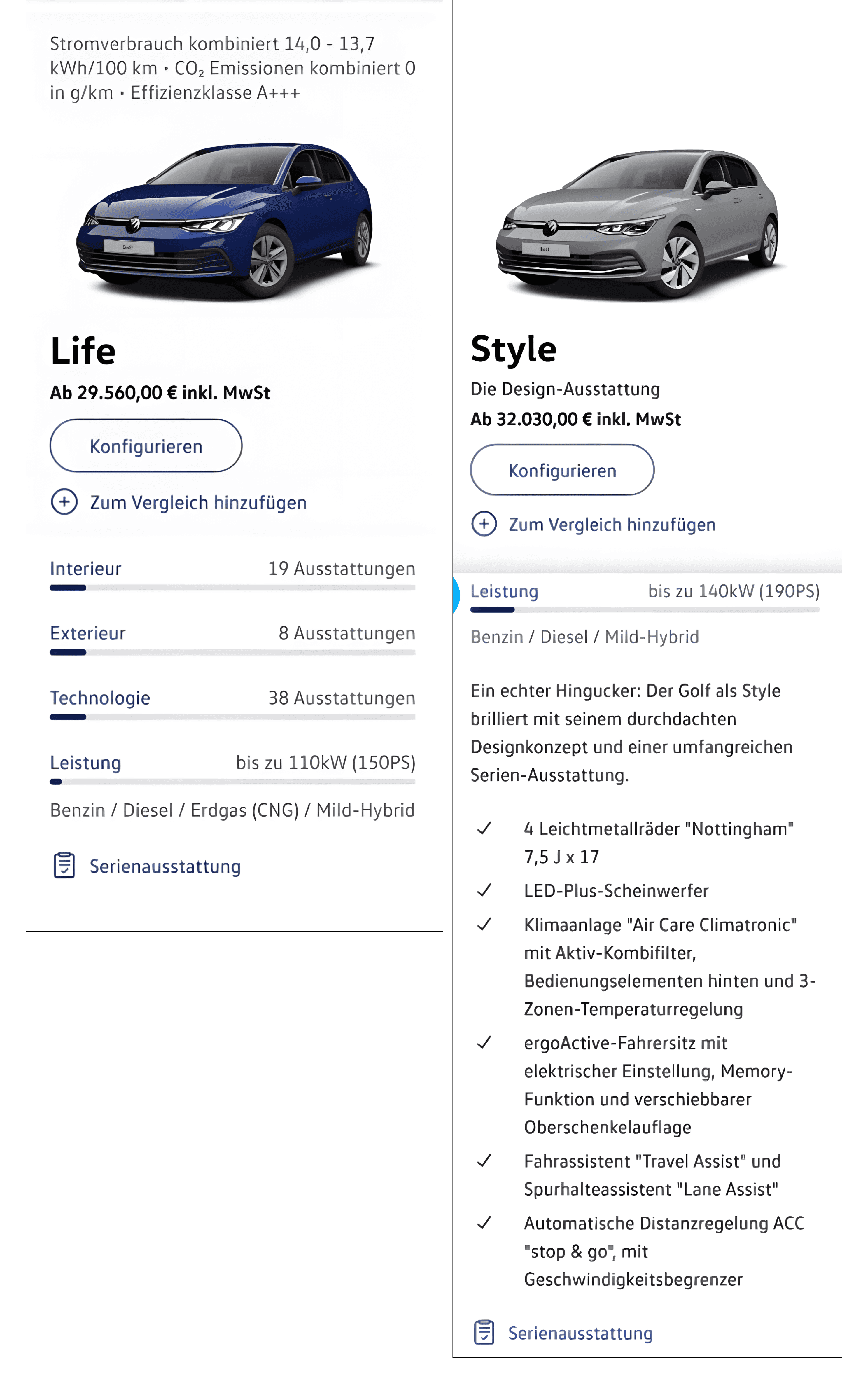
The differences between prototype versions from our team were mainly on the second step (trim selection), where we tried to articulate trim terms like “Life, Style, R-Line” in both visually appealing and practical way as progress lines, rather in special visuals no other automative brand have tried. To the first step (Model selection), we have added quick filters, sorting, and 3/4 CGI hover view and together with Configure team, we came up with navigation.
Our focus group of 5 people for Model selection testing were between 27 - 55 years, from IT sector to Retail salesperson, all of them were car buyers.
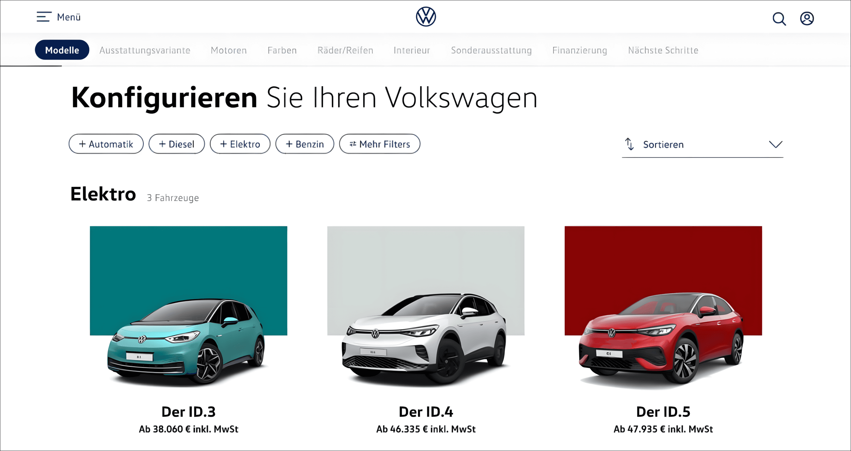
Model selection of both prototypes
Prototype version A vs B differences
Outcomes from testing
First step (Model selection) improvements were praised very well, quick filters were frequently used within participants to narrow down the selection of cars and users mentioned that the hover effect from 3/4 view to side view was very appealing and followed by words like “Seeing both views is very practical, to know how many doors the model have”. Unfortunately, wordings of model categories “MPV or Variant” were unclear for users since this terminology is used almost only within automotive industry or enthusiasts. Strangely enough, the sorting functionality was used only with one person and was overshadowed by wishes to have an option for quick comparison between at least two models.
However, second step (Trim selection) of prototype A was fairly unsuccessful, it took a lot of attention on first glance, to some extend that one user thought the progress bar could be filled later on, at other configurator steps, which was the wrong assumption and showed us major usability issues. Participants were more pleased with the prototype B, with the bullet point visual, where they could clearly see what the users are getting as standard with each trim.
Outcomes
With all outcomes considered as a team, together with our stakeholders, we have implemented the most successful items of the testing first (like filters, categories or navigation). At some point we had to remove the blue line from navigation bar since the line wasn’t always on a correct position for certain breakpoints, often not even close to where the user was.
Cars are now visually presented in a 3/4 CGI of each model with the side view on mouse hover (Mobile view have only 3/4 CGI view, which is more practical since user can see e.g. how many doors the model has).
Filters are designed in a way that most used 5 are visible at all times and when user selects different one from dropdown, they are appearing in-between 5th and “More filters” button.
We have changed from secondary to primary button when the user is hovering. Analytics proved that drop off was majorly reduced. Decision is based on guiding the user in a proper direction thought the journey tunnel, since user could see only one primary CTA vs 6+ secondary CTAs.
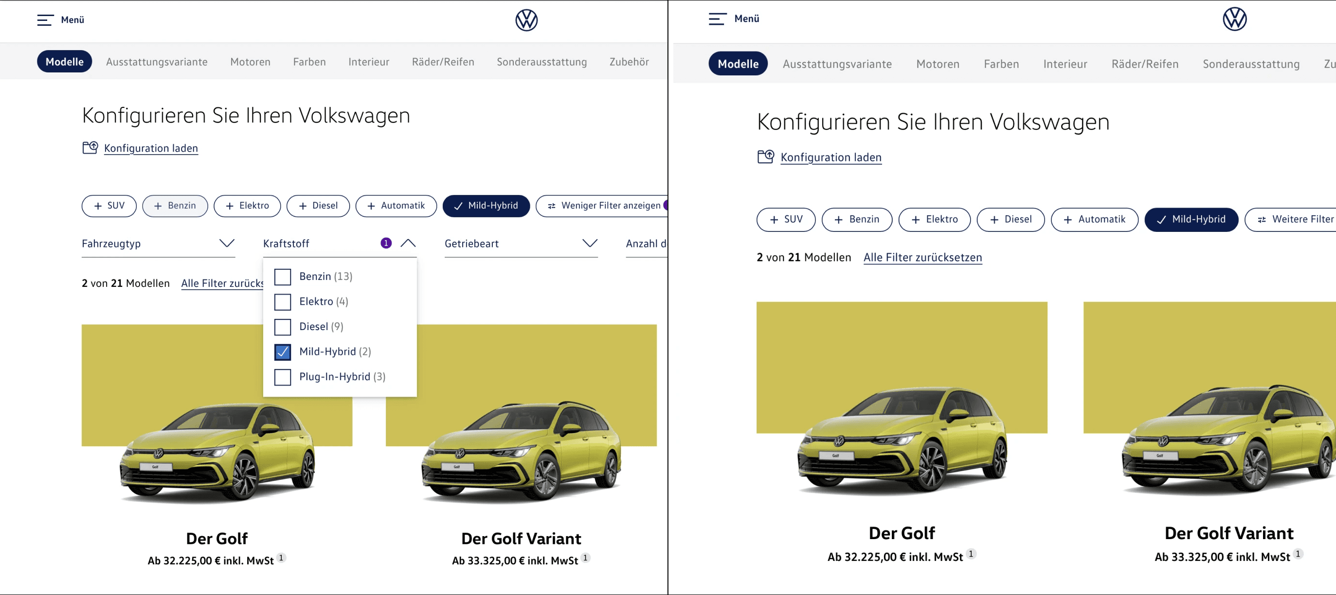
Filter behaviour on live page
For trim selection we have also implemented categories (together with split line) and the filters mentioned earlier, but we decided not to pursue progress bars to explain trims, so we left bullet points as explanation.
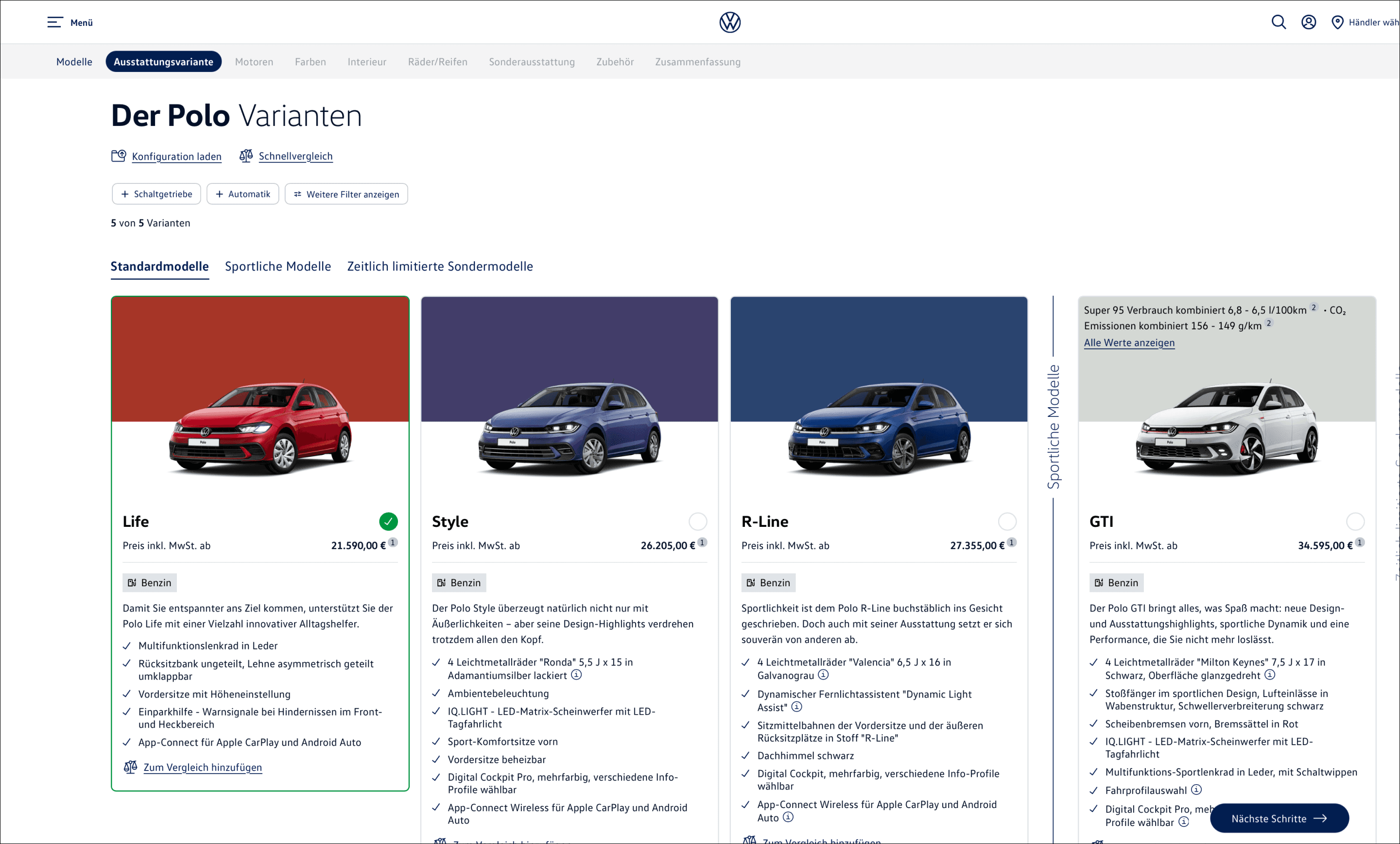
Trim selection improvements